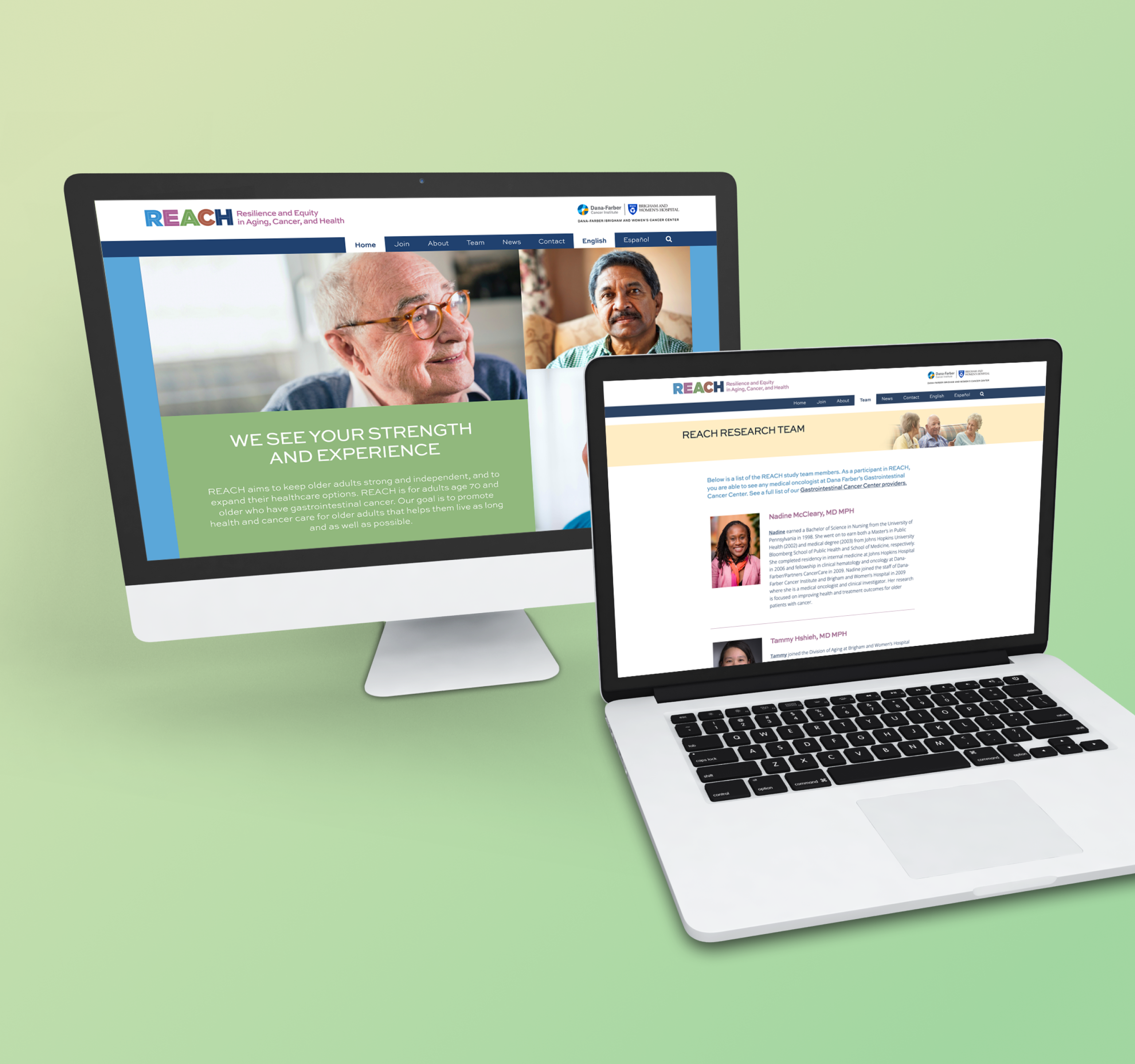
MaGIC

MaGIC logo

Lindsay Frazier, MD

The Health Communication Core worked with the Consortium to strengthen the group’s identity and outreach efforts. The Consortium came to us at an important stage: Its membership had grown rapidly, the rate of its publications was accelerating, members were being sought out for advice, and requests to join the Consortium were increasing.

To support and to amplify all of this work, HCC designed the MaGIC brand—its visual identity—to speak directly to an important set of attributes:

  • Strong scientific vision. MaGIC is leading new science that is making new treatments possible.
  • Collaboration. Alongside this ambitious research and clinical work is a truly collegial spirit—a recognition that the best achievements come when a team, representing a great diversity of scientific approaches from researchers across the globe, works together with mutual respect and good cheer.
  • Record of achievements. Through the strength of its science and its commitment to collaboration, MaGIC has been a very productive academic enterprise, measured in terms of publications, clinical trials, and funding—which has ultimately led to better treatments and outcomes for patients.

HCC created a colorful, dynamic icon out of a set of four converging “M”s and paired it with custom sans-serif lettering for the coalition acronym to produce a memorable logo. Following logo development, HCC then created a series of collateral materials, from a new MaGIC Consortium website and informational postcards to conference tags and totes used at the group’s annual international gathering in 2019.

MaGIC logo shown in a variety of materials